Work / 2024
MarmorAn identity for a 1930s cinema that shows forty films a month.
- Client
- Marmor Kino
- Year
- 2024
- Role
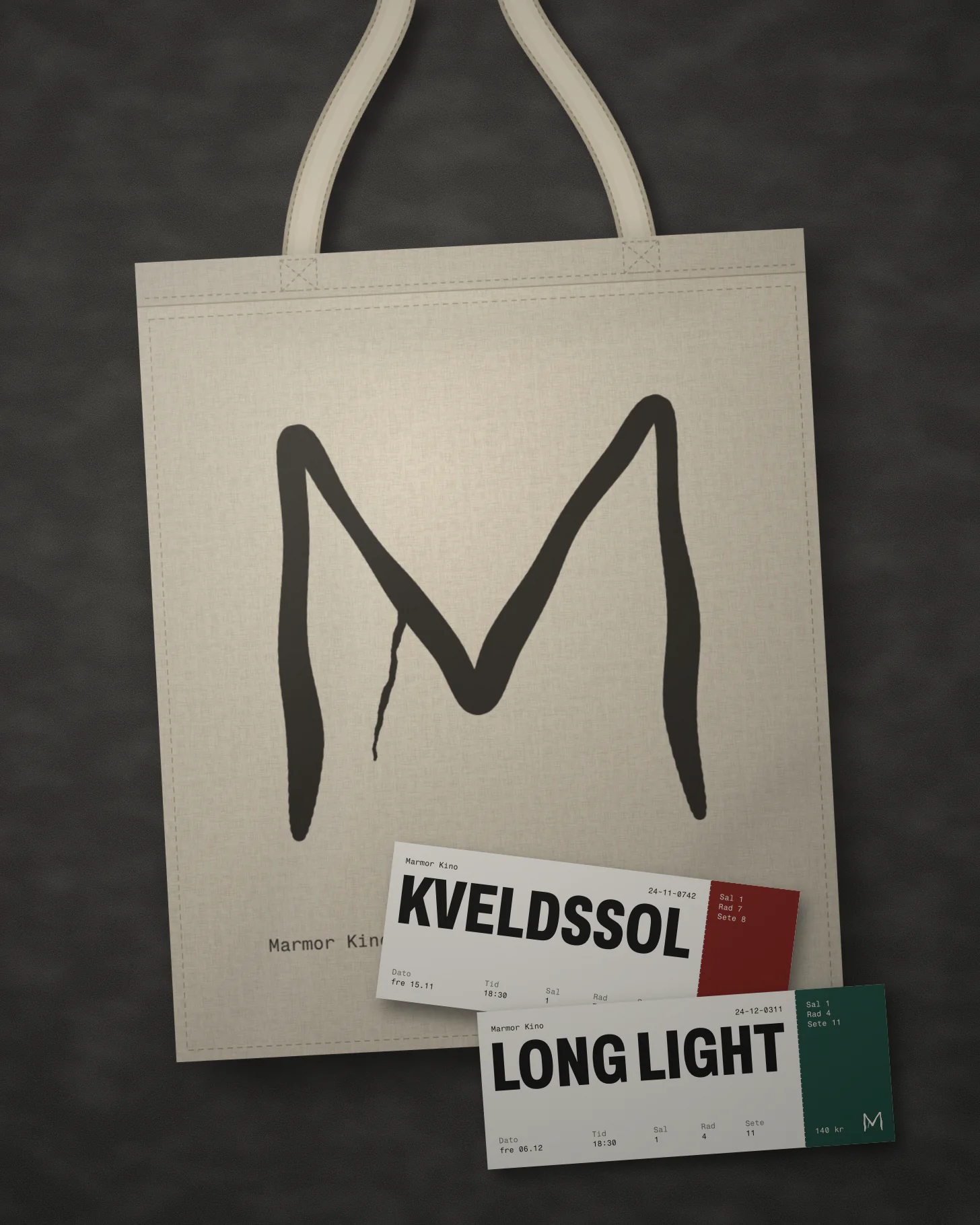
- Identity, Poster system, Website and tickets, Poster maker
- Team
- Ingrid Solberg, Selma Varga, Mats Eide
The brief
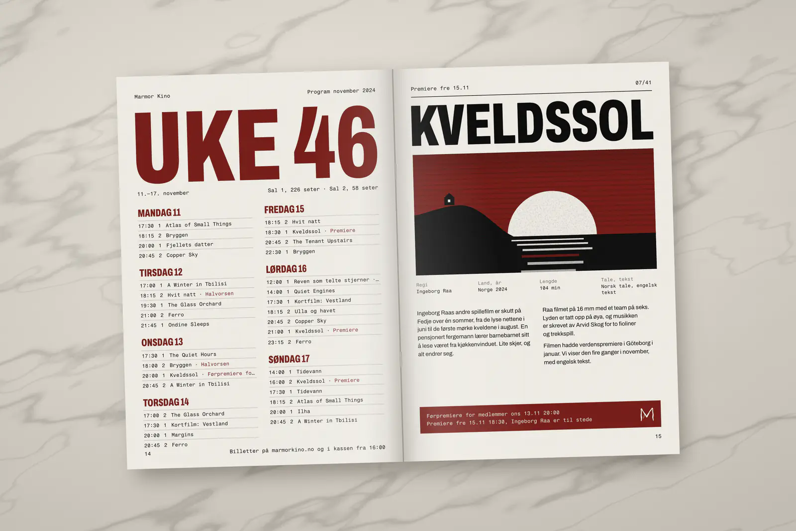
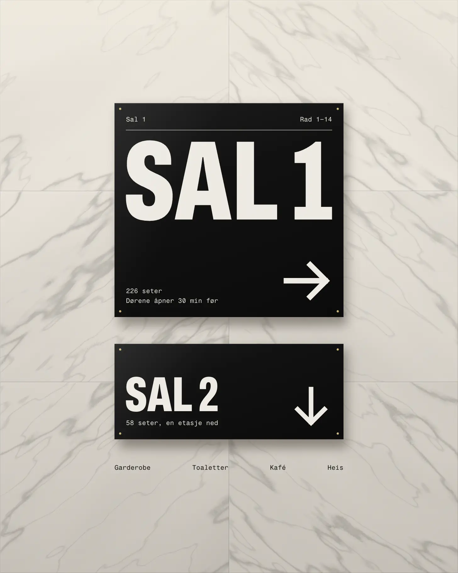
Marmor Kino opened in 1938 in a marble-clad building on Olav Kyrres gate in Bergen. It has two screens, of 226 and 58 seats, and shows about forty films a month: new releases, a retrospective, children’s matinées and the odd silent film with a pianist.
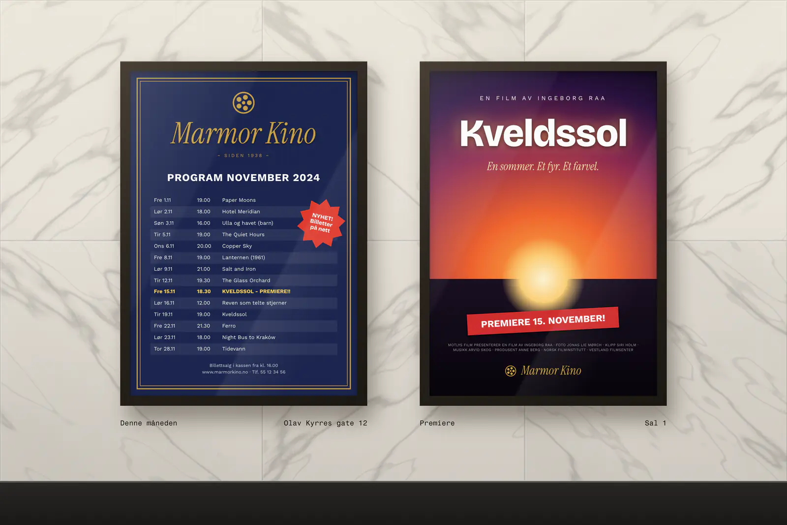
Until 2024 it had a gold serif logo, a navy programme sheet and posters made from whatever template came to hand. A freelance designer charged per poster, so eight of the forty films got one. The rest were a line on the sheet.
The brief was an identity the cinema could run by itself, every month, with no designer in the building. Five people work front of house. None of them use design software, and the posters go to the printer on a Wednesday.
What we decided
- 1
The title fills the width, every line
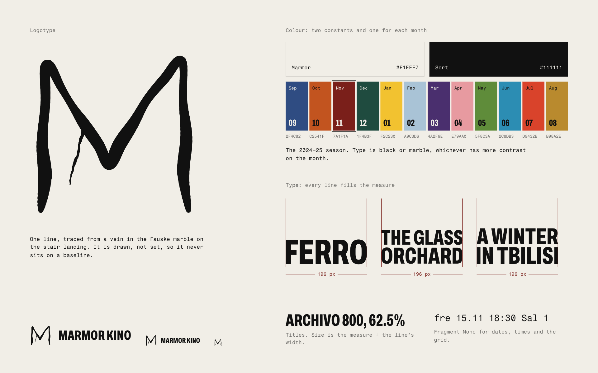
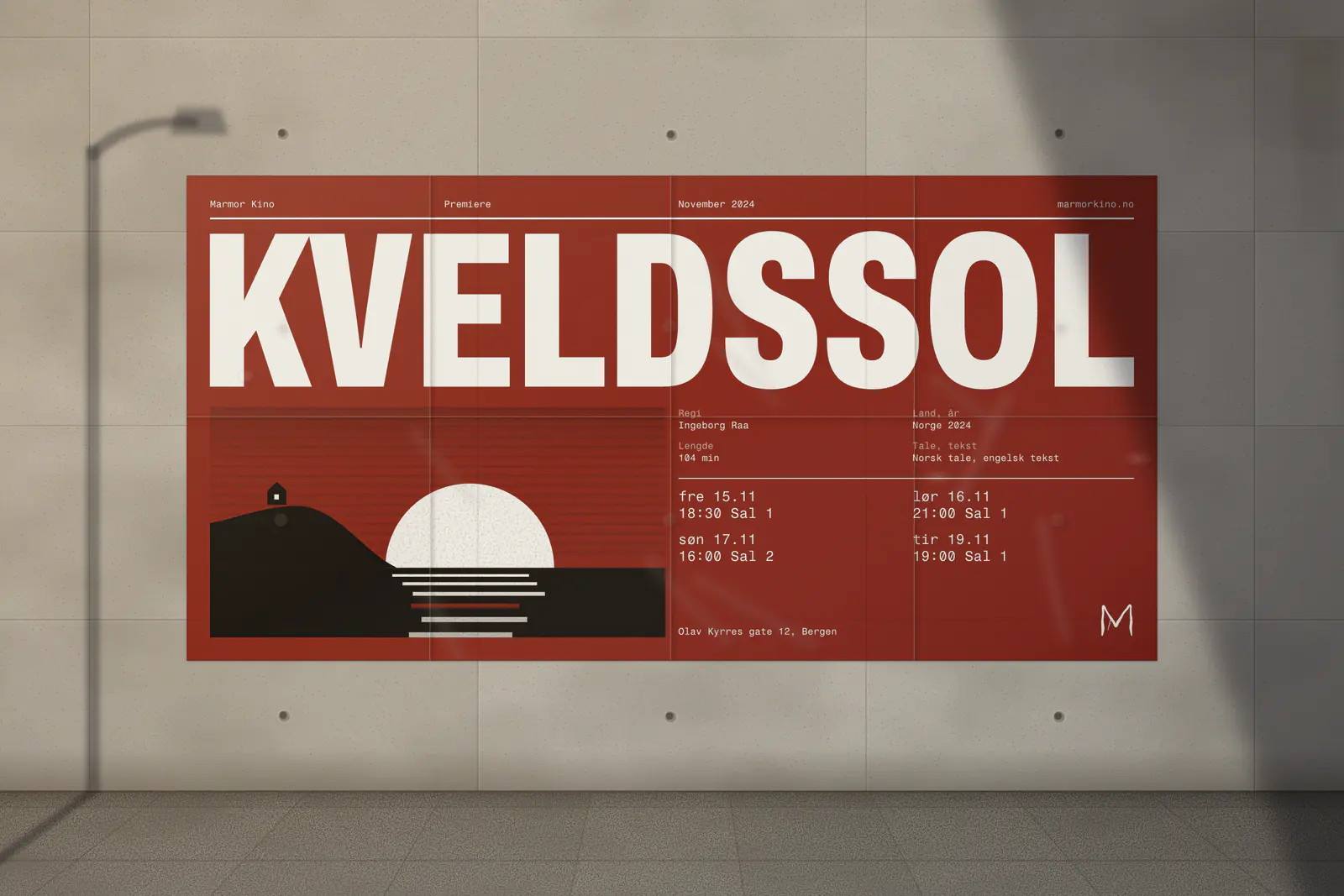
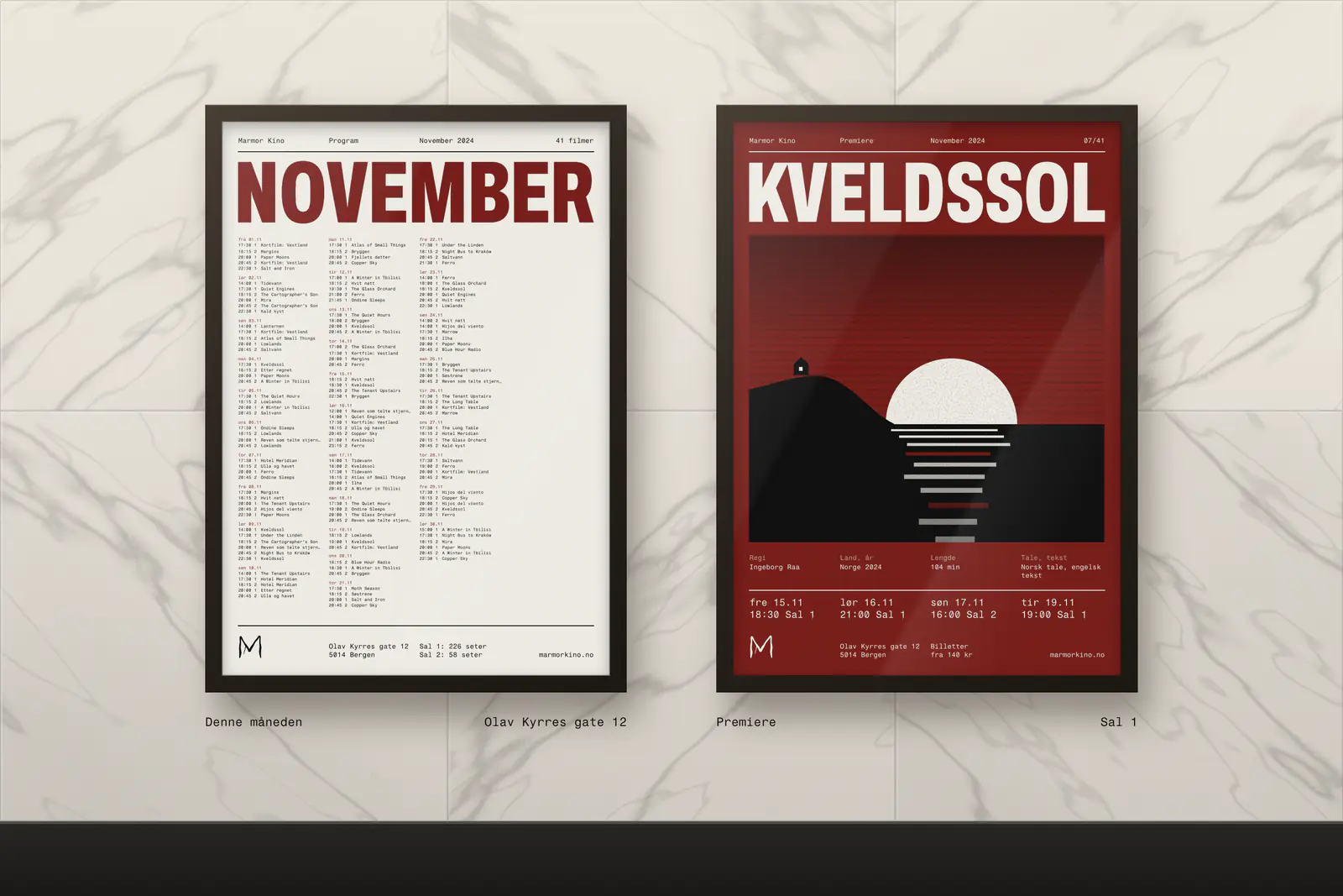
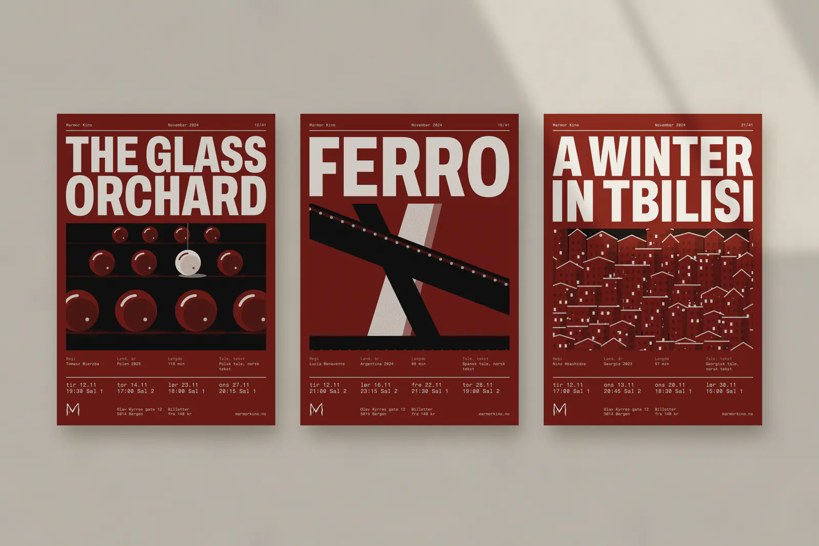
Every title is set in Archivo at 62.5% width, and each line is sized to fill the measure exactly. FERRO runs one line with capitals 19 cm tall; A Winter in Tbilisi breaks into two lines of 12.6 and 13.2 cm. We tried a fixed size first. Long titles ran to four lines and short ones looked lost. The rule keeps forty posters a month related without making them alike.
- 2
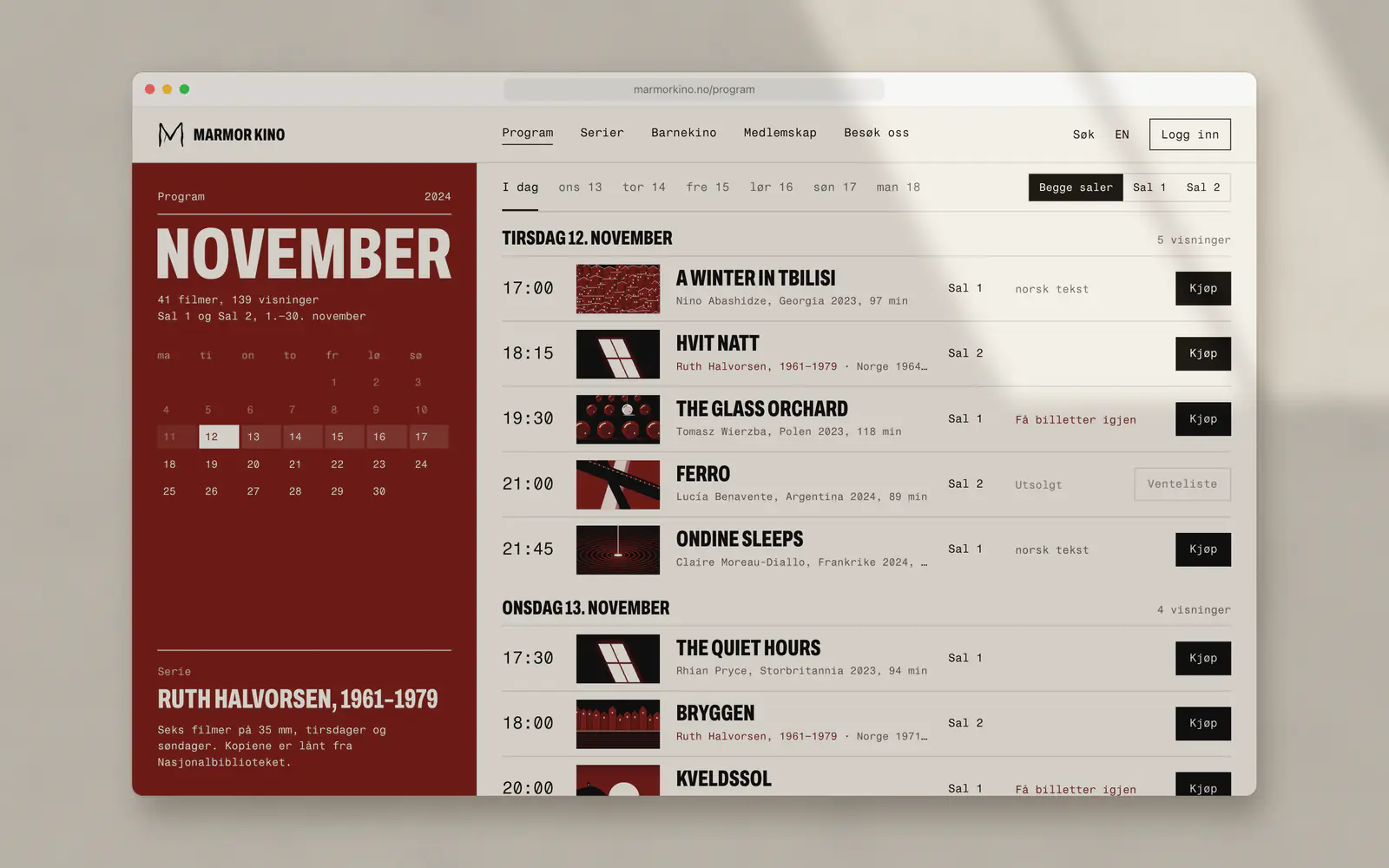
One colour a month
Each month has a colour, chosen with the season’s programme: oxblood for November, spruce for December, signal yellow for January. Posters, facade cases, booklet and website all change on the first. We tried a colour per film and a colour per genre. Forty colours read as noise, and the staff argued about genres. Type is black or marble, whichever has more contrast.
- 3
An M taken from the building
The logotype is one line traced from a vein in the Fauske marble on the stair landing. It is drawn, not set, so it never sits quite level. We rejected film reels, projector beams and anything with sprocket holes. The building was the one thing no other cinema in Bergen had.
- 4
Times in mono, in the same place
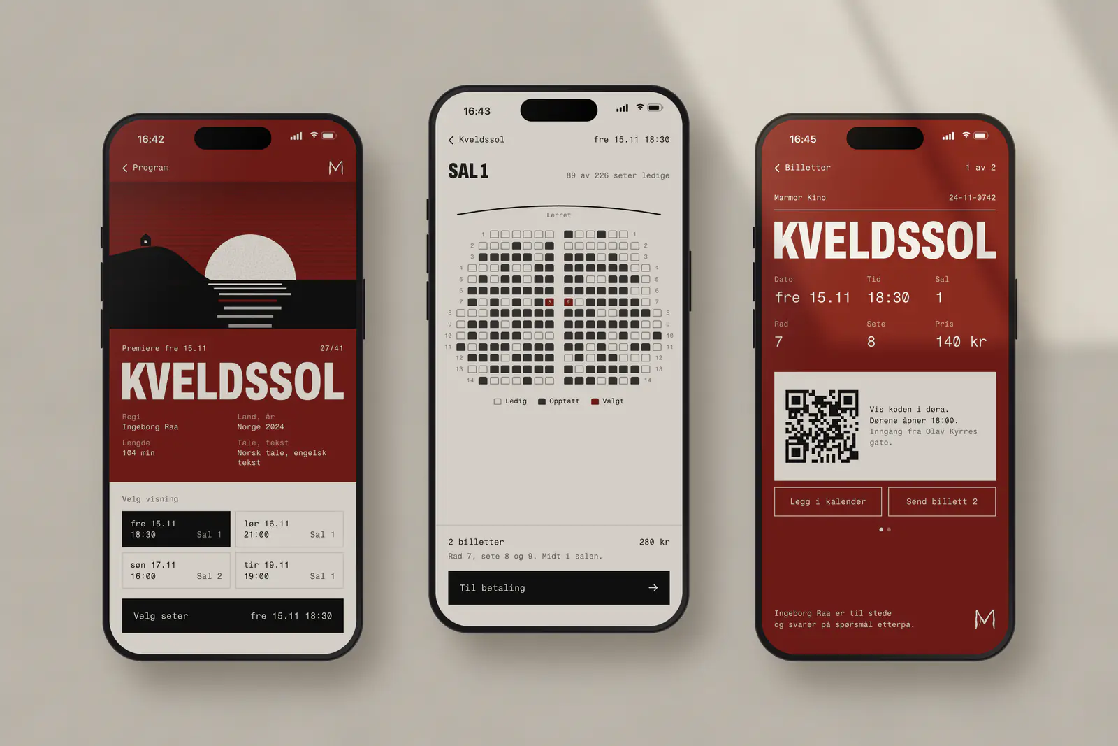
Dates, times and screens are set in Fragment Mono on a four-column grid that never moves. Someone scanning a wall of posters finds “fre 15.11 18:30 Sal 1” in the same corner every time. The website, the tickets and the booklet use the same grid and the same abbreviations.
- 5
The staff make the posters
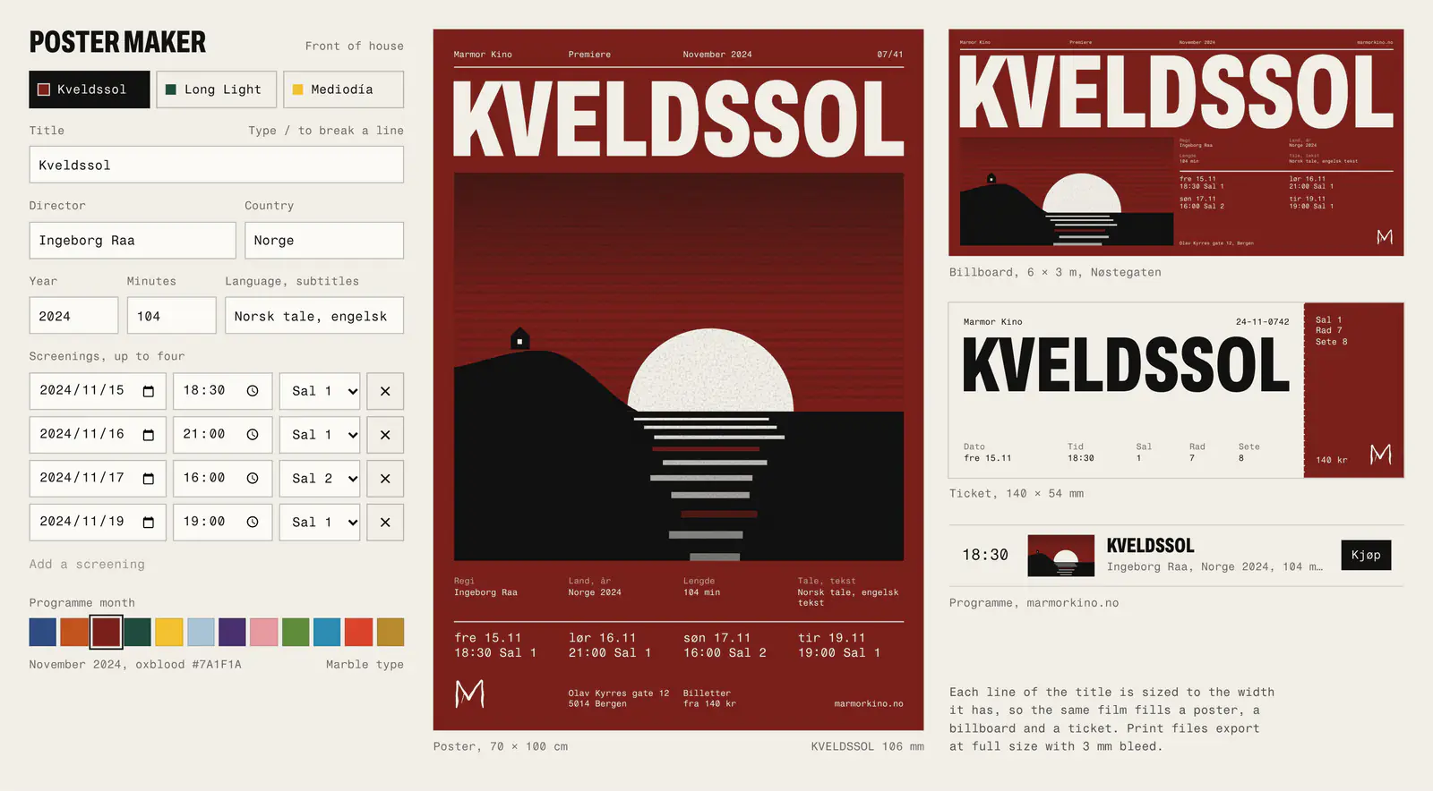
Mats built a poster maker that runs in the browser. Staff type the title, director, dates and month, and it sets the poster, the 6 × 3 m billboard and the ticket together, then exports print files. It knows the width of every letter, so a title is fitted before anyone adjusts it. A film takes about ten minutes.
What happened
The identity went up on 1 September 2024 with the autumn season. Every film now gets a poster, forty or so a month, and each month’s set goes to the printer in one batch.
We built the website and the ticket screens with the cinema’s booking provider, then handed over the poster maker, the type rules and the season’s colours in October. Marmor chose the colours for 2025–26 itself.
Fitting the title
We set the first posters by hand, nudging each line until it touched both margins. It took twenty minutes a title and only we could do it. So we wrote the rule down: measure the line, divide the width by it, and that is the size.
Line breaks come from the same sum. The poster maker tries every way of breaking a title, drops any that leave a one- or two-letter word on its own line, and keeps the one whose smallest line is largest. Staff can still force a break with a slash.
“We used to choose which eight films got a poster. Now every film has one by Wednesday, and the person who booked the film makes it.”
- films with their own poster in November 2024, up from eight a month
- 41
- median time to make a poster, billboard and ticket
- 11 min
- tickets sold online, autumn 2024 against autumn 2023
- +34%
- members in March 2025, up from 1,910 a year earlier
- 2,480
Marmor Kino’s figures, September 2024 to March 2025.